
blog
February 1, 2023
How To Create Your Brand Colour Palette in 4 Steps
The Peach Blog
Crafting a cohesive brand colour palette is an essential part of creating powerful branding. Having the right colours representing your brand increases recognition and memorability – but it can seem overwhelming to get started! Here’s an easy way to create yours so you can start using them in your own designs with confidence.
1. Start with words that reflect your brand
Your brand colour palette is essential for making a lasting impression and conveying the right message.
But how do you pick which ones to use? By selecting words, you’ll be able to comb through colours with a description in mind. Start by reflecting on your values, goals and ideal clients – these will give great insight into what words best reflect your desired aesthetic. organic, bold, warm; whatever speaks most clearly about your business. Use word tools like WordHippo as inspiration. Remember to select words that will last as your business changes, rather than sticking with the trends.
Here are a few spectrums of traits that might help you identify your brand:
Trendy —- Timeless
Prestigious —- Affordable
Trustworthy —- Rebellious
Friendly —- Formal
Youthful —- Mature
Feminine —- Masculine
Cold —- Warm
Elegant —- Bold
2. Try to match your words with colours or moods through images / a mood board
When crafting your brand identity, colours play an integral part in helping define who you are. Through understanding the psychological implications of colour interpretation, brands can achieve a look that evokes certain feelings from their audience. To craft an impactful look, gain insight from research in colour psychology which may offer clues as to how different hues translate emotionally when paired together. For instance: blue combined with gold is often synonymous with royalty or luxury whereas if partnered up with pink – might invoke much more of a playful mood instead!
I love experimenting by creating visual inspiration boards on Pinterest for exploring these concepts further!
Allow your creativity to flow by creating a personalised inspiration board! Incorporate everything from colours and fonts to images that reflect the essence of your brand. Get inspired to create a unique board that reflects your brand and personality, but don’t forget the ideas/words from Step 1.
For extra creative energy, head outdoors or explore the streets-whatever motivates you best. Anything that suits you and your brand. If hands on is more up your alley, get crafty offline; magazines, brochures and postcards can help bring together an incredible mood board right over your desk space for reminders throughout each day as you think deeper into what will define your brand.
TIP: If you also love to work analog for such matters go to your local Bunnings or similar hardware warehouse and pick up some colour swatches from the painting section. They always have a beautiful range of colours and also little painting booklets where you can get some inspiration from. It’s easy to mix and match colours this way.
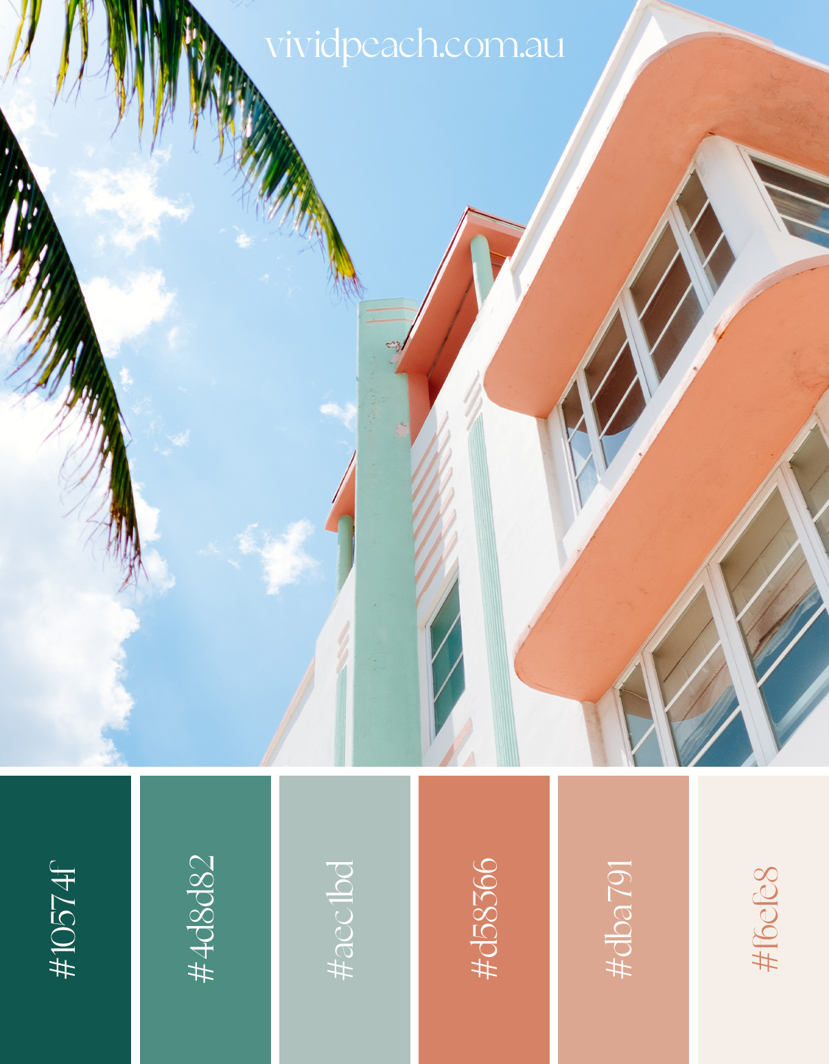
3. Pick five colours from your inspiration board
Once you are happy with your mood board (and please don’t rush this step, as it will be essential for the look and feel of your brand) we get started with picking the colours.
Utilise tools like Photoshop Colour Picker for precise hex codes and choose roughly five shades that not only suit your style but also create contrast between lighter and darker tones. A balance between hues from each colour family can help establish harmony and appear more natural throughout all design elements. Although there is no hard rule or limit on how many colours should be used, as this will depend on what best reflects your brand’s overall aesthetic needs! Generally, between 5-10 colours is recommended – having more could get out of control and create a disquieting effect.
4. Designate specific colours
Having a brand colour palette is essential to any strong brand identity. Selecting the right colours, however, requires careful consideration.
Pick your primary colour
Start by selecting a primary hue that instantly calls to mind your business – this could be Tiffany’s iconic blue or Netflix’s signature red for example. Your primary colour will be most closely identified with your business.
Choose your secondary colours
To accompany the main shade, choose two-to-four complementary hues that can act independently or as sidekicks next respective pieces within the same graphic design project. Secondary tones should bring out and complement it
Keep in mind that there are many ways you can go about choosing these shades: contrasting for impact or supportive for subtlety could both work depending on what best reflects the spirit of your company!
A professional and visually-pleasing aesthetic is easily attained with a well thought out colour scheme. Colour palette is essential for the successful design of any product. To that end, two widely-used colour schemes are analogous and monochromatic which help to create a pleasing aesthetic.
Analogous colour scheme
An analogous colour palette incorporates close variants of the main hue, creating harmony amongst shades that play off one another nicely.
Monochromatic colour scheme
A monochromatic approach uses tints and tones to tastefully emphasise your primary choice while keeping things tied together within its own suggested colour family.
Contrasting colour schemes
Drawing from the full spectrum of colours, contrasting hues can create striking visuals that make your brand pop. Consider a complementary colour palette or an energetic selection of equally-vibrant shades to give off a modern and playful vibe!
Select neutral colours
The importance of neutrals in creating a successful brand identity shouldn’t be underestimated – they are an essential component that can help your assets stand out. White, black and various shades of gray offer you the versatility to create beautiful backgrounds for text and visuals alike.
TIP: If you jump on the trend of only using neutral tones (which looks absolutely devine) you need to make sure to check your website on colour contrast. A lot of website who use these colours nowadays tend to have a problem with contrast and therefore make it hard for some peer groups to read which leads to a decrease in UX/ User Experience. Same goes for the branding trend of overlapping fonts in the logo. So always check contrast and transparencies.
Accessibility is key, and having tools to help make sure color contrast levels are optimal can go a long way. We recommend Contrast Checker and Colour Contrast Analyser — two easy-to-use online resources that can provide the assurance you need for compliant content!
ARE YOU OVERWHELMED AND NEED HELP WITH YOUR BRANDING? WE GOT YOU COVERED!
Check out our Branding Packages and contact us for a free discovery call.
blog overview


